FBS Prints Team
Printing, Signage & Growth Specialists
Most people searching for a local business in Westmont are doing it from a phone, often while standing in a parking lot or sitting in a car deciding where to go next. If that search leads to a site that's hard to read, slow to load, or awkward to tap through on a small screen, the visitor leaves before ever seeing what the business offers.
Why Mobile Design Isn't Optional Anymore
Google uses mobile-first indexing, meaning it primarily evaluates the mobile version of a site when determining rankings, not the desktop version.
- A site that isn't mobile-optimized can rank lower even if the desktop version looks great
- Small tap targets and cramped menus frustrate mobile visitors and drive them to a competitor
- Slow mobile load times compound the problem, since mobile connections are often less reliable than home wifi
- Click-to-call buttons and easy-to-find contact info matter more on mobile, where visitors are often ready to act immediately
For a Westmont service business, a visitor searching from their phone is frequently closer to making a decision than one browsing on a desktop, which makes a smooth mobile experience directly tied to lead generation.
Building a Genuinely Mobile-Friendly Site
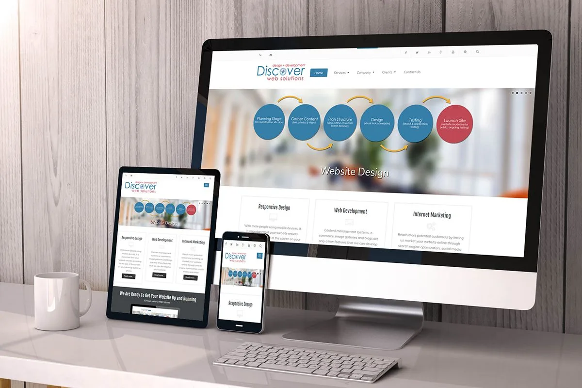
Mobile-friendly means more than a site that simply resizes to fit a smaller screen.
- Use large, easy-to-tap buttons and a simplified navigation menu
- Keep text readable without requiring visitors to zoom in
- Place phone numbers and contact forms prominently near the top of the page
- Compress images and minimize scripts to keep mobile load times fast
- Test the site on multiple real devices, not just a browser's mobile preview mode
Frequently Asked Questions
Does Google actually rank mobile-friendly sites higher?
Yes. Mobile-first indexing means Google evaluates the mobile version of a site as the primary version when determining search rankings.
Is a responsive design the same as a mobile-friendly design?
Responsive design is a good foundation, but true mobile-friendliness also depends on load speed, tap target sizing, and how easily visitors can find key information like a phone number.
How can a Westmont business tell if its site is mobile-friendly?
Google's Mobile-Friendly Test tool gives a quick assessment, though testing the actual site on a real phone often reveals usability issues the tool doesn't catch.
What should a Westmont business prioritize when improving mobile website design?
Prioritize readable content, simple navigation, touch-friendly buttons, fast-loading pages, visible contact information, and easy access to important services.
Can mobile-friendly design help Westmont businesses generate more leads?
Yes. A simple mobile experience can make it easier for visitors to find services, call the business, submit a form, or take another desired action.
Author Biography
FBS Prints Team
FBS Prints helps businesses grow with practical signage, printing, direct mail, web design, and SEO guidance built around real-world execution.
Next Step
Need help applying this to your business?
Explore the related service page for a deeper breakdown, then contact our team for a quote or project guidance.